
A Major Party Brand

I reduced bounce rates and increased AOV by 7% with a Shopify redesign.

I optimized navigation and user flows, and refined the visual design to reduce bounce rate and maximize conversion.

See Prototype

Shopify

Product Design

Figma

Role

Lead Product Designer

Timeline

6 Weeks

Team

1 Shopify developer and an external branding team

The Challenge

A major party supply store had an outdated brand identity and website, and conversion was suffering as a result.

I was brought in to lead both the experience and visual redesign of the site, working closely with their new branding team and a single Shopify developer to bring the new brand to life across the site.

The goal was to create a simpler and more beautiful e-comm experience, and the foundation for future growth.

I approached this process in close collaboration across branding and engineering, and conducted the following tasks:

Stakeholder Interviews

Understood business goals, brand vision, and technical constraints directly from stakeholders and the Shopify developer.

Wireframes

Simplified navigation, improved typography, and reduced clicks across the home page, PDP, and navigation before any visual design was applied.

Accessibility

Advocated for WCAG compliance with the branding team.

Branding & UI

Skinned the approved wireframes with the branding team's updated visual identity across the site.

Wireframe and Prototyping

Branding and product design were occurring in real time, so I stripped back the experience to wireframes.

I focused on the main conversion funnel: Landing page, PLP, PDP, Cart, Checkout, and Navigation. This design process was in collaboration with engineering and stakeholders, and required making comprimises based on what was technically feasible and our tight, 6 week timeline for a full site redesign.

The redesign covered the full purchasing flow, grounded in my years of DTC experience.

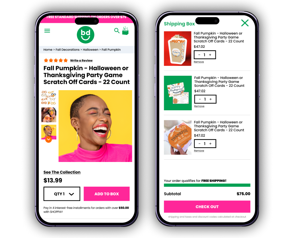
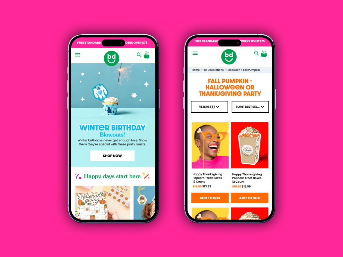
The paths included a refreshed homepage, a browsable PLP with filters and sorting, a PDP with a playful “Add to Box” call to action, and a streamlined cart with shipping progress and subtotal built in.Each screen carried the new branding while staying grounded in the wireframe-tested flow.

The Solution

The solution was a cleaner, more purchasable experience from homepage to checkout.

I infused their new branding while maintaining WCAG accessibility standards. This was my first time actively advocating for WCAG best practices with a branding team that hadn't originally accounted for it, a good reminder of how critical it is to understand how branding holds up across every touchpoint.

New home page and PLP

PDP and cart design

The impact

+34% Revenue

Revenue increased 34% in the first month

The redesigned purchasing flow translated directly into stronger sales performance right out of the gate.

+7% AOV

Average order value increased 7%

A streamlined flow from PDP to checkout made it easier for customers to add more to their box.

-7% Bounce Rate

Bounce rate dropped 7%

Cleaner navigation and typography kept more visitors engaged instead of leaving.
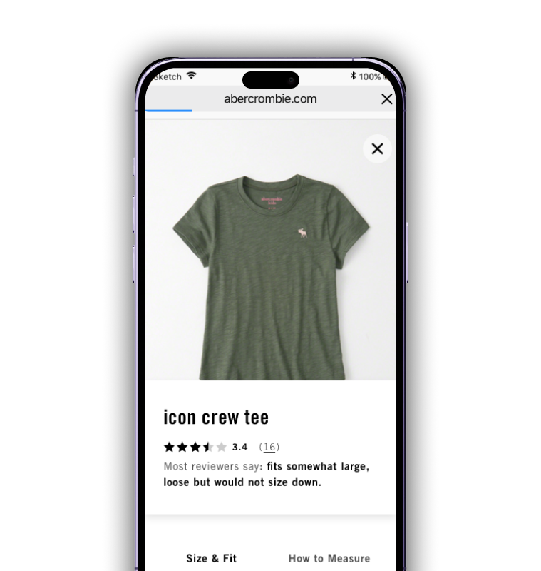
I reduced returns by creating a better size guide experience.

​

See Work

I created the vision for a sleep expert AI chatbot for sleep deprived adults.

See Work

© Olivia Girgis 2026 All Rights Reserved

Product Design & Illustration

A Major Party Brand

I reduced bounce rates and increased AOV by 7% with a Shopify redesign.

I optimized navigation and user flows, and refined the visual design to reduce bounce rate and maximize conversion.

See Prototype

Shopify

Product Design

Figma

Role

Lead Product Designer

Timeline

6 Weeks

Team

1 Shopify developer and an external branding team

The Challenge

A major party supply store had an outdated brand identity and website, and conversion was suffering as a result.

I was brought in to lead both the experience and visual redesign of the site, working closely with their new branding team and a single Shopify developer to bring the new brand to life across the site.

The goal was to create a simpler and more beautiful e-comm experience, and the foundation for future growth.

I approached this process in close collaboration across branding and engineering, and conducted the following tasks:

Stakeholder Interviews

Understood business goals, brand vision, and technical constraints directly from stakeholders and the Shopify developer.

Accessibility

Advocated for WCAG compliance with the branding team.

Wireframes

Simplified navigation, improved typography, and reduced clicks across the home page, PDP, and navigation before any visual design was applied.

Branding & UI

Skinned the approved wireframes with the branding team's updated visual identity across the site.

Wireframe and Prototyping

Branding and product design were occurring in real time, so I stripped back the experience to wireframes.

I focused on the main conversion funnel: Landing page, PLP, PDP, Cart, Checkout, and Navigation. This design process was in collaboration with engineering and stakeholders, and required making comprimises based on what was technically feasible and our tight, 6 week timeline for a full site redesign.

The redesign covered the full purchasing flow, grounded in my years of DTC experience.

The paths included a refreshed homepage, a browsable PLP with filters and sorting, a PDP with a playful “Add to Box” call to action, and a streamlined cart with shipping progress and subtotal built in.Each screen carried the new branding while staying grounded in the wireframe-tested flow.

The Solution

The solution was a cleaner, more purchasable experience from homepage to checkout.

I infused their new branding while maintaining WCAG accessibility standards. This was my first time actively advocating for WCAG best practices with a branding team that hadn't originally accounted for it, a good reminder of how critical it is to understand how branding holds up across every touchpoint.

New home page and PLP

PDP and cart design

The impact

+34% Revenue

Revenue increased 34% in the first month

The redesigned purchasing flow translated directly into stronger sales performance right out of the gate.

+7% AOV

Average order value increased 7%

A streamlined flow from PDP to checkout made it easier for customers to add more to their box.

-7% Bounce Rate

Bounce rate dropped 7%

Cleaner navigation and typography kept more visitors engaged instead of leaving.
I reduced returns by creating a better size guide experience.

​

See Work

abstract painting

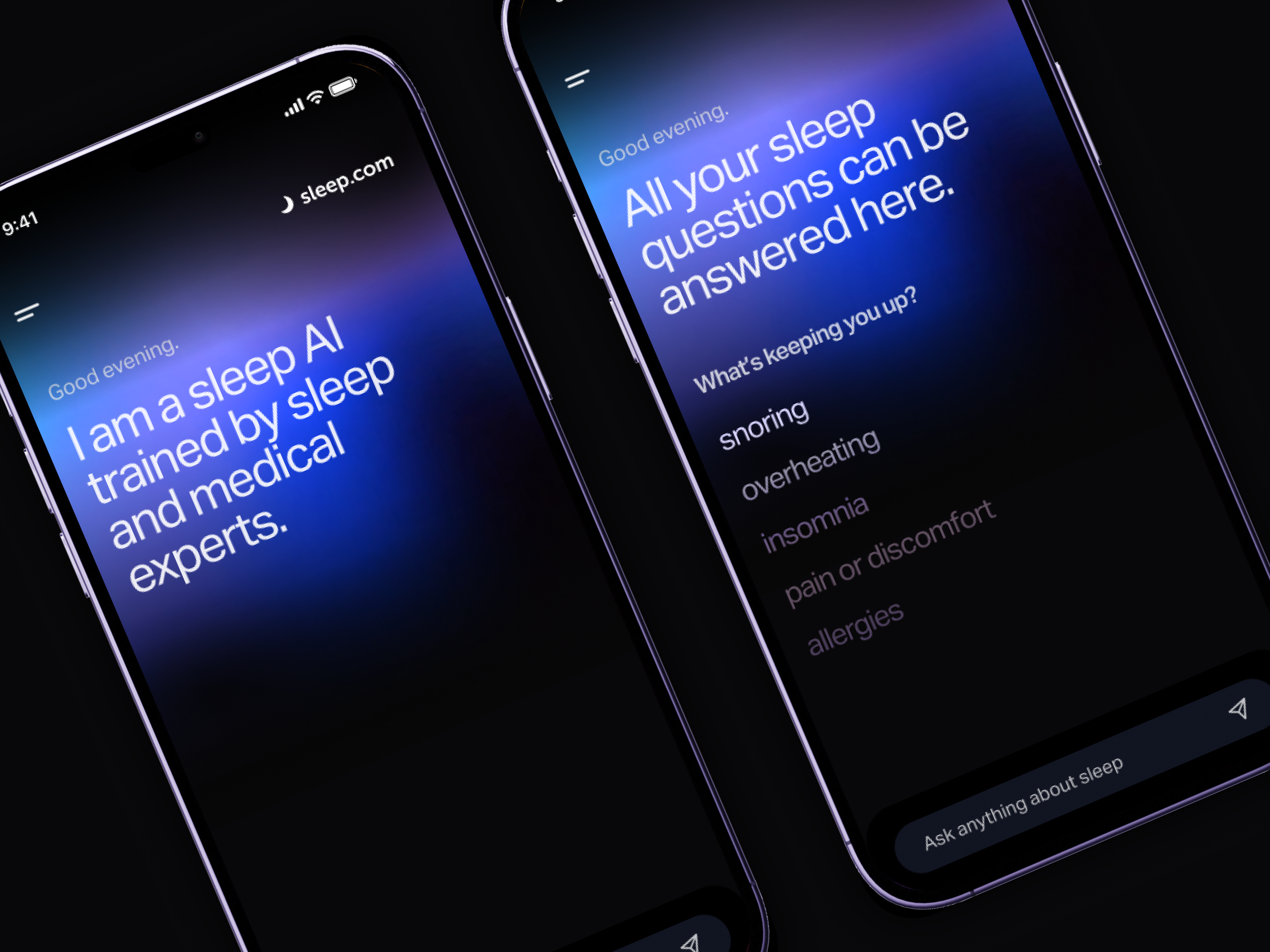
I created the vision for a sleep expert AI chatbot for sleep deprived adults.

See Work

© Olivia Girgis 2026 All Rights Reserved

Product Design & Illustration

A Major Party Brand

I reduced bounce rates and increased AOV by 7% with a Shopify redesign.

I optimized navigation and user flows, and refined the visual design to reduce bounce rate and maximize conversion.

See Prototype

Shopify

Product Design

Figma

Role

Lead Product Designer

Timeline

6 Weeks

Team

1 Shopify developer and an external branding team

The Challenge

A major party supply store had an outdated brand identity and website, and conversion was suffering as a result.

I was brought in to lead both the experience and visual redesign of the site, working closely with their new branding team and a single Shopify developer to bring the new brand to life across the site.

The goal was to create a simpler and more beautiful e-comm experience, and the foundation for future growth.

I approached this process in close collaboration across branding and engineering, and conducted the following tasks:

Stakeholder Interviews

Understood business goals, brand vision, and technical constraints directly from stakeholders and the Shopify developer.

Wireframes

Simplified navigation, improved typography, and reduced clicks across the home page, PDP, and navigation before any visual design was applied.

Accessibility

Advocated for WCAG compliance with the branding team.

Branding & UI

Skinned the approved wireframes with the branding team's updated visual identity across the site.

Wireframe and Prototyping

Branding and product design were occurring in real time, so I stripped back the experience to wireframes.

I focused on the main conversion funnel: Landing page, PLP, PDP, Cart, Checkout, and Navigation. This design process was in collaboration with engineering and stakeholders, and required making compromises based on what was technically feasible and our tight, 6 week timeline for a full site redesign.

The redesign covered the full purchasing flow, grounded in my years of DTC experience.

The paths included a refreshed homepage, a browsable PLP with filters and sorting, a PDP with a playful “Add to Box” call to action, and a streamlined cart with shipping progress and subtotal built in.Each screen carried the new branding while staying grounded in the wireframe-tested flow.

The Solution

The solution was a cleaner, more purchasable experience from homepage to checkout.

I infused their new branding while maintaining WCAG accessibility standards. This was my first time actively advocating for WCAG best practices with a branding team that hadn't originally accounted for it, a good reminder of how critical it is to understand how branding holds up across every touchpoint.

New home page and PLP

PDP and cart design

The impact

+34% Revenue

Revenue increased 34% in the first month

The redesigned purchasing flow translated directly into stronger sales performance right out of the gate.

+7% AOV

Average order value increased 7%

A streamlined flow from PDP to checkout made it easier for customers to add more to their box.

-7% Bounce Rate

Bounce rate dropped 7%

Cleaner navigation and typography kept more visitors engaged instead of leaving.
I reduced bounce rates and increased AOV by 7% with a Shopify redesign.

See Work

abstract painting

I created the vision for a sleep expert AI chatbot for sleep deprived adults.

See Work

© Olivia Girgis 2026 All Rights Reserved

Product Design & Illustration